[ad_1]
Text by Yusaku Kamekura, 1962
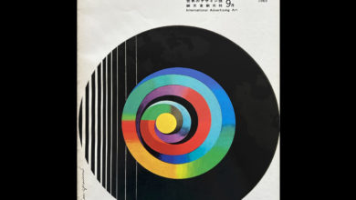
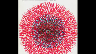
Design 11 No. 40 is an out-of-print and rare issue of a slim 54pp Japanese magazine from the 60s dedicated to all things design. This issue includes a feature on boat interior design and modernist furniture. However, this issue stands out for its distinctive and eye-catching cover by the renowned designer Ikko Tanaka, and for an original text written by Yusaku Kamekura on his process and experience with corporate logo design. This is illustrated with 31 examples of his own work. What also marks this feature out is that it includes some examples of those logos that never made it to use, those that never saw the light of day, which is the central premise of the article. The magazine is entirely in Japanese, however, BP&O had the Kamekura article translated, and this makes up the body of this post. Materially speaking, the magazine mixes glossy and uncoated papers, single and full colour printing and although quite light in content is an excellent example of design publishing of its time. If you liked to buy a copy of this, it is available on the LogoArchive.Shop.

The following is an article written by Yusaku Kamekura. Kamekura writes of his experience dealing with clients, delivering concepts and the realities of getting a logo signed-off in the 1960s. For the designers of today, some will recognise this experience as still being present in designer-client exchanges. This is the first time that this piece has been translated into English and published online.

As a designer, when you create a logo it becomes a part of your family. This is because you always question if the company or organization you helped create a logo for was able to achieve the best. It would pain me to see a company I designed a logo for go out of business. Fortunately, all the companies I’ve designed a logo for have accomplished great things, which is a relief.

How a logo is chosen is always a struggle. In some cases, I would create 1 logo and it would be used, in others, I would create 10 or 20 and none would be chosen. However, in most cases, I would design 6 logos and one of them would be chosen. The decision on which logo to choose is usually made at board meetings but at times is also chosen by only the president When too many people try to decide on a logo it never works well because of the contradicting opinions. For example, some companies collect different votes taken at board meetings to choose the best option. Though, when 30 people try to decide on a logo, they will continue arguing even though they don’t have specialised artistic knowledge and nothing ever gets decided. Rather, they complain, so they won’t have to take responsibility, leading to no decision being made. In other words, the design fee is just thrown away and you’re stuck with an incomplete logo.

The collection of logos here are of those thrown away by companies. They are “Designs that don’t see the light of day”. A collection of the 5 or 6 designs that were not chosen by companies, some were never even considered to be a logo. This happens when the manager abandons his responsibility, refuses to meet me, the designer, and keeps an employee responsible, never being able to see the logos. There are also some pieces of work that I created for fun. At times, the logo used can be my favorite one, but sometimes it can be my least favorite. You may wonder why I would submit something I dislike. Even if I don’t like some designs, it’s my preference and in some cases it matches the companies image. Logos must symbolize not only my taste but the company’s as well. It’s hard to abandon that “it’s like” feeling of a company, for instance, it’s like an oil company logo, it’s like a publishing company logo, it’s like a sweets companies logo. This is the most difficult part of designing logos.

On the last page (above and below), I included a collection of my most recent works called “Saw the light of the sun”. These are my most recent designs that are being used by companies, and I believe it may be the first time many of you will see these logos. Even these completed logos have had many designs thrown away.


Source link


