[ad_1]
Text by Richard Baird.
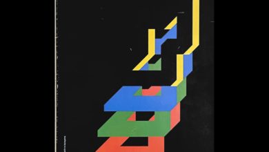
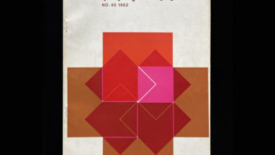
“Graphic Design” / グラフィックデザイン was a monthly magazine from Diamond that moved between the flourishing practice of graphic design (commercial art) and more broadly, visual culture (historical and of the present) both nationally in Japan and internationally. The magazine was distinctive in its proportionality (nearly square), and in its mix of papers. These included dyed uncoated and glossy papers, colour and black and white imagery. But also for its “Graphic Design Labatory” section which often played with the intersection of the graphic, print technologies and materials. This magazine is available on the LogoArchive.Shop.

Title: Graphic Design
Issue: Number 11, April
Year: 1963
Pages: 90
Size: 300mm × 260mm
Format: Soft Cover Magazine
Language: Japanese w/ English Summery
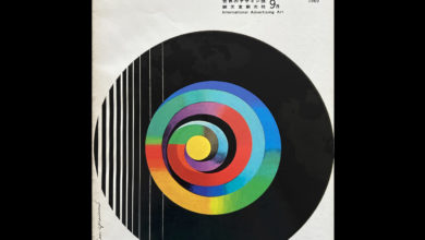
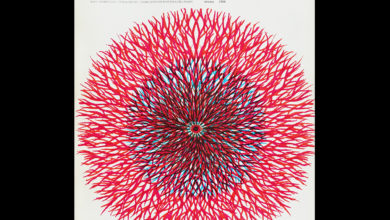
This issue really stands out for the initial graphic impact of the cover, created by HAYASAKI Osmau and MURAKOSHI Jo. Its first impression is of a gradated circle on the white surface of a nearly square magazine. And, on closer inspection, the revelation of it being a photograph of a new dawn and dove. Or is it dusk? It is a beautiful gesture,

Although a predominantly Japanese language magazine, this is one that includes English summaries towards the back, printed on a lovely mustard dyed paper. These offer a range of insights. Features in this issue; work by Shigeo Fukuda, including a few of his logos, a section on calendar design–past and present, a piece on new trends in LP jacket design and another on the “Design Policy of Colombia Records”. Many of the insights remain relevant today, and there is some great colour imagery.


As with previous issues, and the real highlight of the publication more broadly, is the section titled “Graphic Design Laboratory”. Where other issues introduced an unusual material element here, FUKUDA Shigeo works with the Mitsumura Printing Company to use graphic design and printing to raise philosophical questions. Below you will find the captions that accompany the images.

Below left–The beauty of natural forms seen in a microcosm is overwhelming. But, for scientists using telescopes and electron microscopes for scientific purposes, out-of-focus images are of little use.
Below right–But beauty maybe sought here, just as we happen to find beauty–beauty which is beyond human handwork–in paper and spoiled printing. But spoilage is no more than spoilage, a byproduct of the printing process.

Below left–In reproducing an oil painting one tries to reproduce as faithfully as possible the original through precision printing techniques. But what happens if the processed is reversed? What if one analyses a master-piece painting by a printing device, entirely independent of the human sense of beauty?
Below right–I chose Fra Angelico’s “the annunciation” from among many realistic paintings of the 15th and 16th centuries. I analysed the painting without trimming it into nets of 12, 4,2 and 0.5 lines and dots, and assembled them later. What change does this bring about in the painting? You can hardly predict the change until you see it in print.

What will happen if the works of Jackson Pollock, Sam Francis and Jasper Jones are subjected to this reverse process? We cannot say that an abstract painting will not be turned into a concrete one. If you put a classical LP on a 86-rpm turntable, music is changed into sounds, quite “modern” sounds at that. – FUKUDA Shigeo.
I wonder what Shigeo Fukuda would make of, and how he would respond to, taking pictures of pictures with a digital camera mounted on a phone? How would that reframe and further this thread of thought? Suffice to say, that there is a beautiful narrative presented in this article, that it is supported by wonderful imagery printed with great care, paired with thoughts of a somewhat philosophical captioning. That there is enough room for the reader to take the though further, and make of it what they will. What a fantastic piece of design writing and publishing! This magazine is available to buy on the LogoArchive.Shop.
Source link


