[ad_1]
From style guides to holy design bibles, every strong brand needs a set of usage guidelines.
But wait a second — you already knew that.
You’re here because you want to understand the building blocks of a beautiful brand guide. Is it striking layout design? A consistent brand voice? Room for brand flexibility?
To answer these questions and inspire your next great branding project, we’ve analyzed style guides from Shazam, OpenTable and Slack.
1. Shazam: An Informative Identity Guide
Shazam’s brand voice guidelines state: “think of Shazam as your friend who knows a lot about music, TV and those cool tidbits from the world around you. When we speak, we keep the talk to a minimum, relate like a human, are conversational, full of surprise and delight.”
This music discovery app does a great job of understanding who they are, and they effectively use their brand guide to reflect this positioning.

Shazam consistently uses a lighthearted and personable brand voice throughout their identity guide. Beginning with the very first page, the guide assumes a helpful tone through social, promotional, commercial, editorial, broadcast, motion & administrative guidelines.
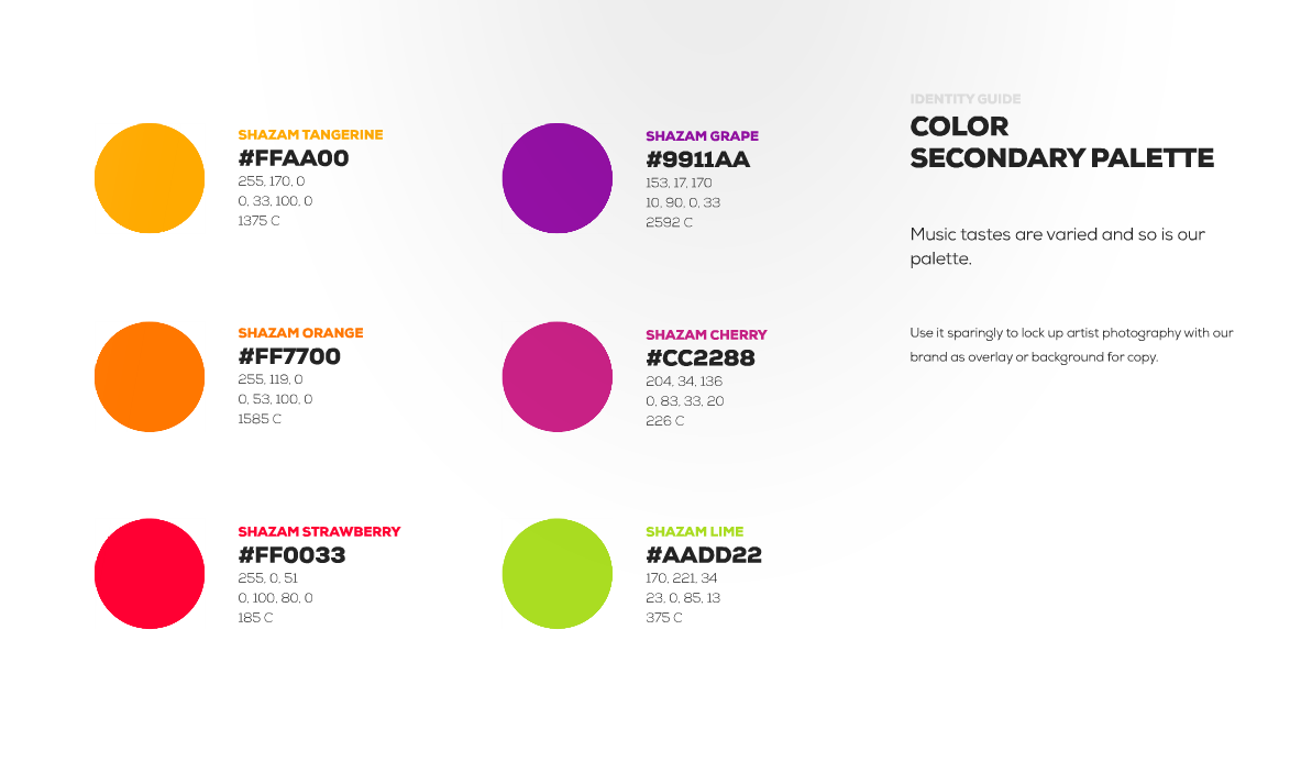
Shazam’s color secondary palette creates room for brand flexibility. For example, the guide states that these six colors can be used “to lock up artist photography” or “as overlay or background for copy.”
This gives designers many options when creating branded marketing materials.
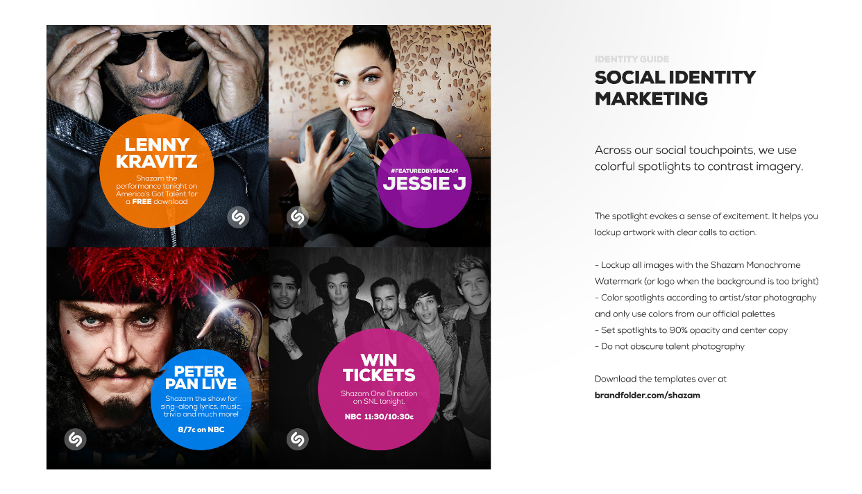
No matter how active your brand is on social media, your brand kit must include guidelines for social identity and promotion. This helps ensure that social media fans experience your brand in a consistent way, and that they know what to expect each time.
Shazam’s social identity guidelines call for the use of a colorful “spotlight” to evoke excitement and lockup clear calls to action.
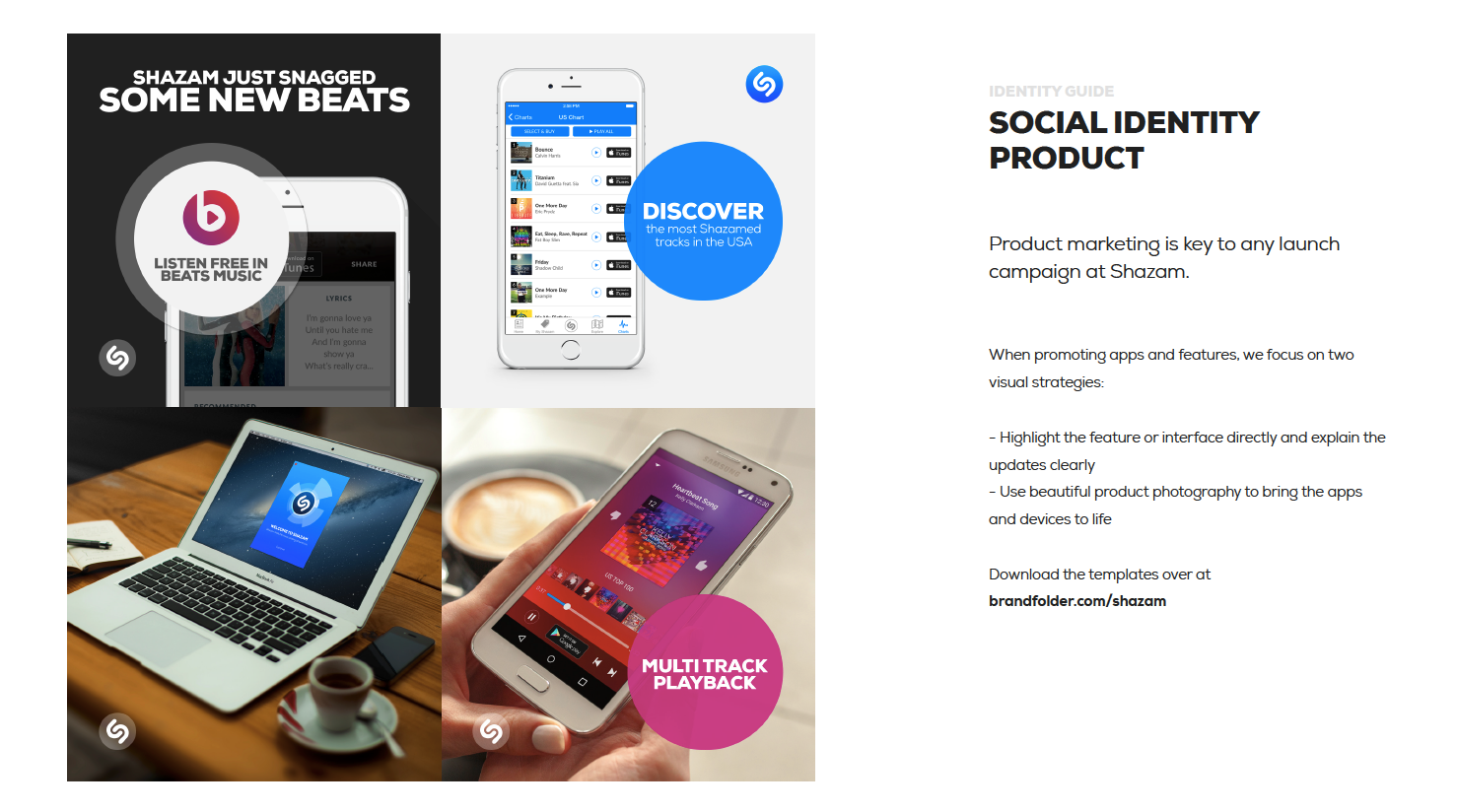
Love what you see? Check out Shazam’s full set of branding guidelines.
2. OpenTable: A Bold Brand Website
Earlier this year, OpenTable introduced an all-new brand identity. With a fresh, minimalist logo and a revamped brand positioning, OpenTable needed a better set of brand standards.
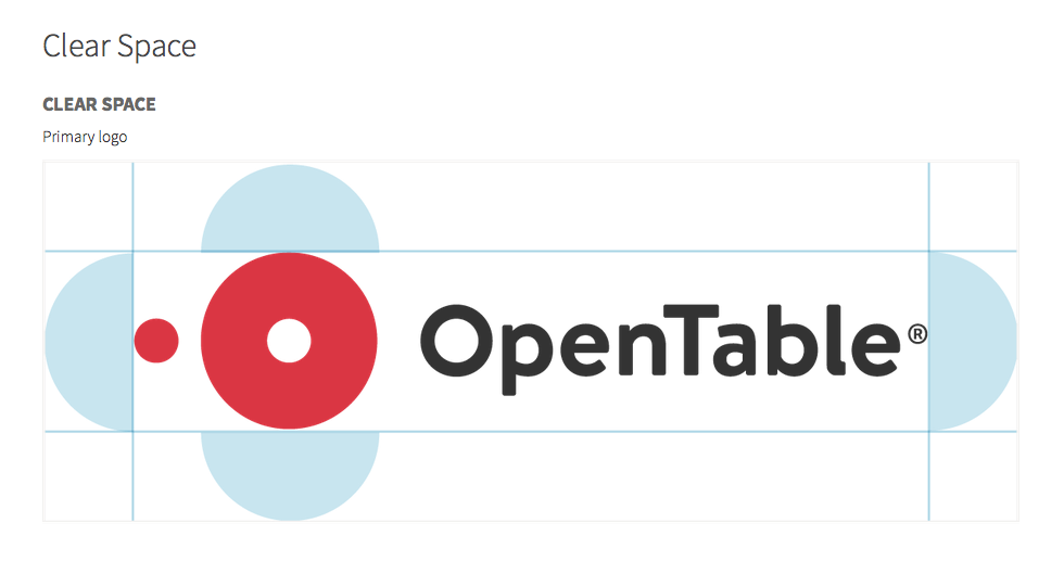
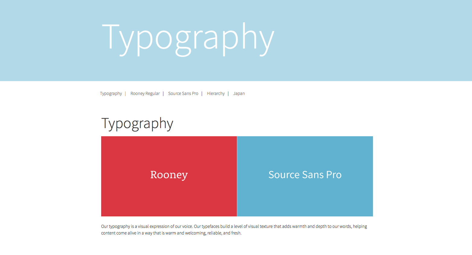
To establish brand consistency publicly, OpenTable created a custom brand kit at brand.opentable.com using WordPress. This website explains all aspects of OpenTable’s brand, from visual elements and guidelines to their overall brand story.
OpenTable clearly defines the connection between their brand voice and their visual brand, proving that they understand the importance of the OpenTable persona.
Their voice guidelines state, “a consistent voice and tone, combined with visuals that express our brand story, help us to express this through a cohesive, recognizable brand personality.”

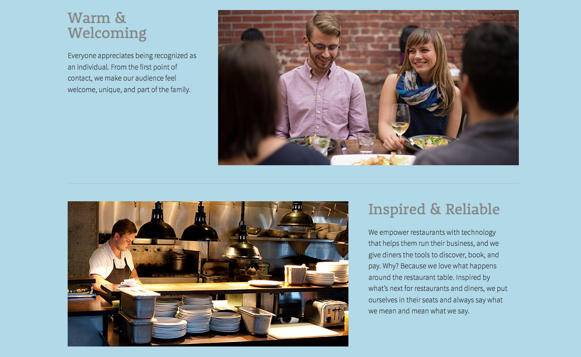
OpenTable uses custom photography and relatable copy to explain the company’s brand pillars. These pillars help solidify their new positioning as a brand that cultivates strong relationships between diners and the food they enjoy in a refreshing, innovative way.
Want to see more? Check out the full OpenTable brand website or see how OpenTable used Brandfolder to manage their major rebrand.
3. Slack: Brilliant Brand Guidelines
Slack’s colorful hashtag logo can be found on computer screens throughout the corporate world. Thanks to their rapid rise to success in the past year, their logo continues to be in high demand.
But without a style guide to clearly define usage of their brand, it would be nearly impossible to maintain a consistent identity. Thats why Slack created a website dedicated to defining their brand’s usage.
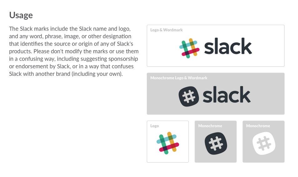
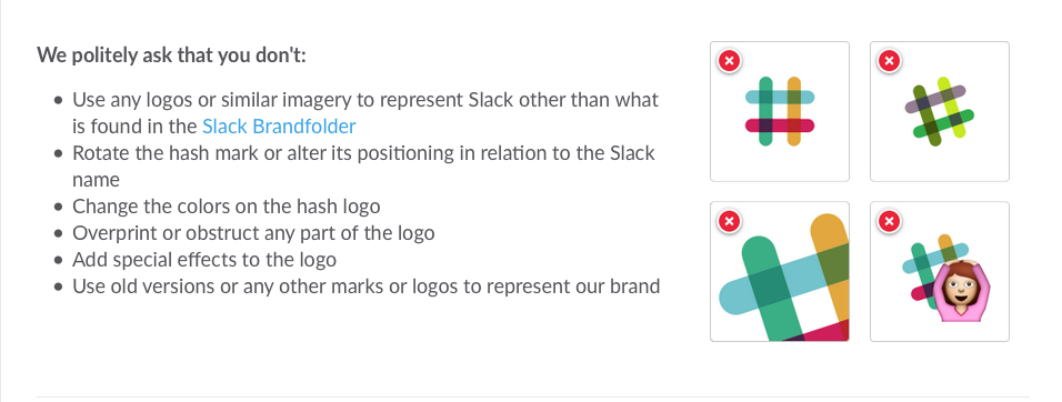
Guidelines for how not to use a logo are just as important as guidelines for how to use them.
Slack tackles this sometimes daunting task with concise bullet points and imagery that are easy to understand. Instead of giving people the freedom to Google outdated and inaccurate versions of their logo, visitors can download assets from the Slack Brandfolder.
Check out Slack’s Branding Guidelines for more brand kit brilliance.
A Beautiful Brand for All
Now that you’ve read this post, you understand the beautiful brand guidelines that live behind Shazam, OpenTable and Slack.
For more tips and tricks on branding, read these 7 Inspirational Branding Quotes Guaranteed to Motivate You or check out these 4 Things to Consider Before Renovating Your Brand.
Michelle Polizzi is the Content Coordinator at Brandfolder, a user-friendly tool for brand asset management. When she’s not busy creating content, you can find her bicycling around Denver or catching a live concert. She’d love to connect with you on LinkedIn.
Source link

